A journey in digital storytelling
chiloong@vslashr.com
Use arrow keys to navigate deck or click on the sections below.
Toggle visibility
Technology is always changing, and with it, the world.
For people to understand data and technology well, we need good interfaces.
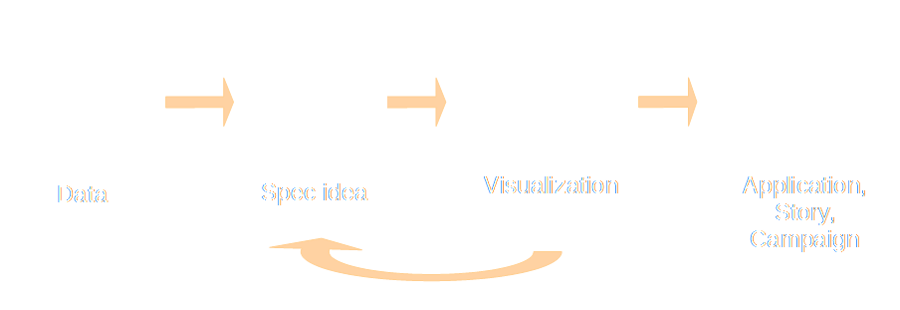
Through visualizations, interactive storytelling and serious games.
To connect the virtual to the real.
We design and build beautiful quality interactive work for clients.
 |
Data visualizations |
 |
Interactive storytelling |
 |
Content gamification |
Visualize data to reveal hidden insights and explain complicated trends.
Build engaging interactive stories, guides and decks.
Tell deep stories through serious games.
Well, you convert dense data into an easy-to-digest human readable format.
Marketers |
Organizations |
|
UX |
Engage audiences | Product design |
Data |
Mine marketing data for KPIs | Gain business insights and transform business models |
Delivery time depends on scope. We often counsel engineering a product iteratively rather than all at once so that it can be refined.

All of these have their own pros and cons.
...and is used more than for marketing or PR

Visualizations help humans spot trends and make sense of data.
Great UX design and content is not easy to do.
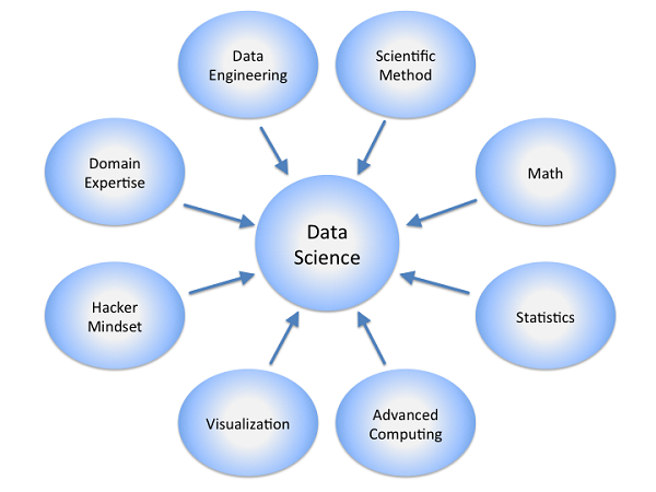
Equally hard to find is deep technical expertise for data products.
And we have both.
Chi-Loong |
Kok Keong |
UX and content |
Web, mobile and data |
| Ex-journalist / PR / marketing / technology hybrid. Past lives in tech, in-house, agency, and media, like Straits Times, British Telecoms, and GollinHarris. | Web and computing guru with a Master’s degree in networking. Past lives in academia and high-tech start-ups like Converscient and Antlabs. Co-founder of web tech company Mobrick. |
If you have created an interesting data visualization on Singapore and you want to share, please ping me at chiloong@vslashr.com.
If you have an interest in data visualizations or storytelling, join our meetups: Hacks/Hackers SG or Data Vis SG
I'm looking for people to help grow Viz.sg as a community site. Visualizing Singapore one dataset at a time, for all to use. Come talk to me!